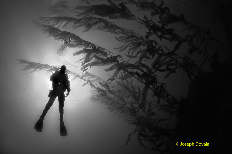
Diver in sil descending into kelp Macrocystis pyrifera, Anacapa Island (Click to enlarge)
Sometimes black and white is just plain cool.
Yeah, the oceans are full of color, seemingly impossibly so sometimes; but the nuances and ‘simple’ feel of a good B&W image is occasionally the way to go. The trick is to decide what makes a good monochrome photo. This can be highly dependant on the person creating and viewing the finished work. Of course, not everything that you point your camera at will translate to a nice B&W. A number of image basics need to be considered such as subject matter, contrast, tonality, luminosity, especially in the muted world underwater. On the other hand it isn’t rocket science either (at least knowing what you like) and it’s never been easier to experiment with these parameters then now in the digital age.
Words & Photos by Joseph Dovala, Dovala Images
Before you get the heebie-jeebies worried about all the Photoshopspeak, rest assured there won’t be any. And our goal isn’t to try and make underwater versions of Ansel Adams or Edward Weston masterpieces. The focus will be on both saving a hum-drum color picture as well as converting a select favorite color viewing to an evocative B&W image.
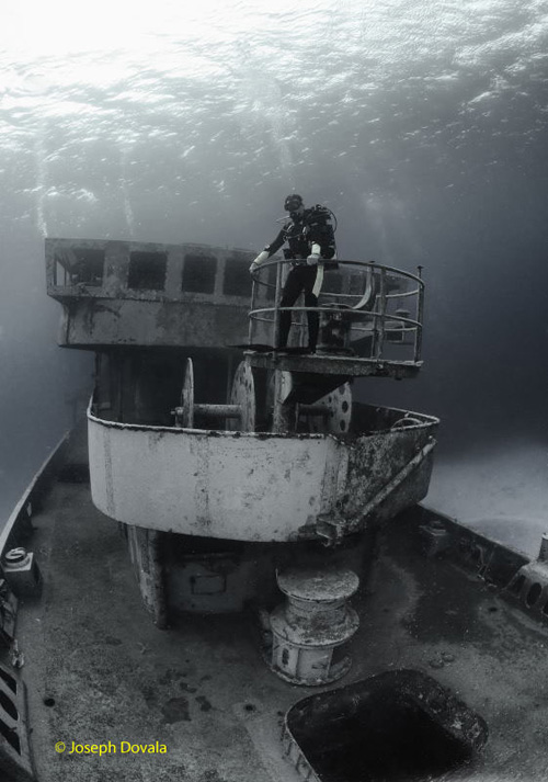
Hilma Hooker artificial reef in Bonaire (Click to enlarge)
Unlike our topside colleagues we are very limited in the big wide angle scenic department. Even color isn’t going to get us very far in this endeavor and the reason is – drum roll please – we’re lucky if we can see a hundred feet. The clearest water is still messing with our visual physics and suspended particles (often a lot as we all know) play further havoc with something we can collectively call contrast. Contrast, obviously, is very important to color photography too. In fact, color can actually hinder contrast when dealing with the pervasive bluish-green world underwater. The lack of contrast almost always breaks the image. B&W image making has been called “a study in contrast” for the final image needs white “whites” and black “blacks.” Well, what does that mean? No grays? Sometimes, but usually what it means is to have a nice gradation from the blacks through to the whites with a broad range of tonalities (grays) in between. Again, it depends on what is being conveyed in the picture. Simple compositions tend to work better with B&W. Remember, without color, the visual representation has to rely on strong form, shape, or texture.

Shark dives, Bahama Banks
While we don’t have the big scenics, we have something else that can be very dramatic in B&W – shipwrecks! Many hulks under the sea are just begging to be captured in monochrome. They tend to be historical, have wonderful shapes and angles, and a sense of mystery. Even grain, or as we now have noise, can actually prove beneficial in providing a taste of “vagueness” to the final image. Just look at all those grainy black and white WWII photos and you’ll see what I mean.
I shoot all my images in color up front no matter what the final rendering will be and in raw format. For the most post processing control it pays to use raw format during capture, that way you have all the file info to work with as you optimize for B&W. It’s certainly not a deal breaker if you don’t start with raw, for many fine conversions can be had from jpeg or tif originals. It doesn’t really matter what software you use as long as you achieve the results you’re looking for. I import the raw file into Capture and convert to B&W, setting the black and white-points using the curves adjustment (Master Lightness Channel, LCH Editor). The contrast usually needs to be boosted so I do that here too. I then move the cyan/red, magenta/green, or yellow/blue sliders as needed (Photo Effects Palette) until I achieve the best look. It’s mostly a game of trial and error doing the adjustments one by one “till it’s finished” and then save and export to whatever file type I need.
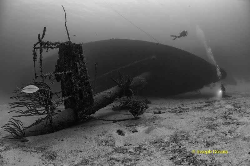
Scuba diver with video camera swims by hull of shipwreck USS Lamson, Bikini Atoll, Marshall Islands, Micronesia, Pacific
There are times that to finish the image I need to move the jpeg or tif file over to another program to refine the results. I usually move the photo over to Photo Shop Elements for some final adjustments. By using the Burn or Dodge Tool and altering the size of the brush (circle) I can darken or lighten select areas as needed to optimize the final picture. This certainly is not a new method as dodging and burning have been used in the darkroom for over a hundred years. In fact, there are a number of features built into 21st century software that are nothing more then electronic versions of very old practices. Excuse me while I go off topic now and rant! For all you anti-digital folks out there who claim that digital capture isn’t real as opposed to film – WAKE UP! All photography from the very first image hundreds of years ago is “NOT REAL” You are taking a three dimensional view and placing it on a flat plane and unless you are shooting with only ~ 50mm lens (full frame) then you are also “lying” as humans only see roughly 45 degrees in focus. Ansel Adams, et al. to a person manipulated their images – to great lengths! I could go on and on, so get over it. You know who you are. For the rest of you, sorry about that. We’ll move on now.
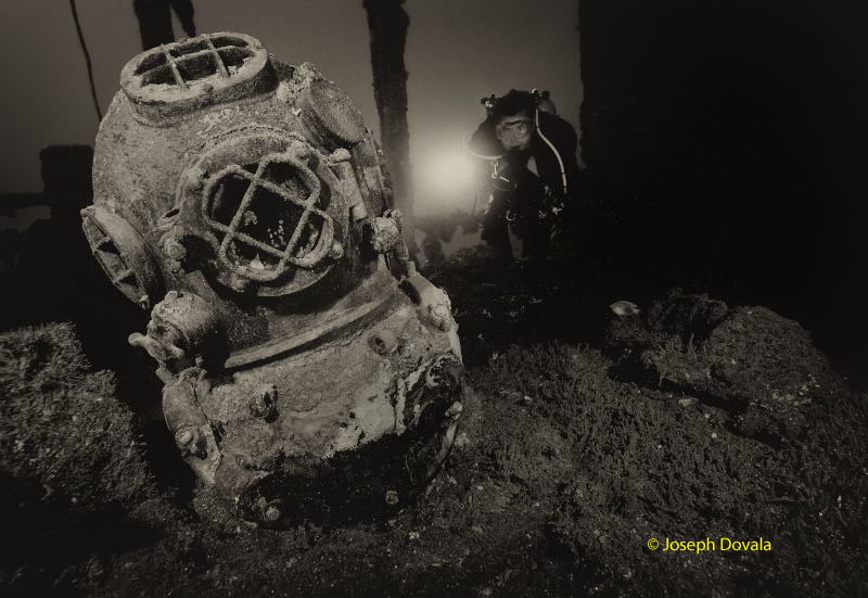
Navy MkV diving helmet on the USS Saratoga, Bikini Atoll
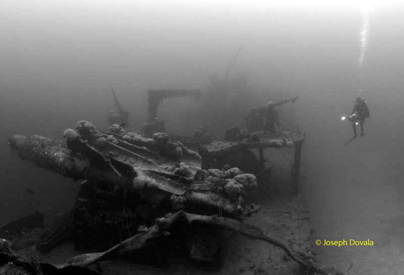
OK, now about those pesky rules needing strong contrast, black blacks, and white whites. Like most photographic laws, these can be stretched or broken to maximize the aura of an image. One feature that B&W is real good at is providing mood. Look at all those Alfred Hitchcock movies. One of the most “sinister” shipwrecks in Bikini Atoll is the Japanese battleship HIJMS Nagato. She was Admiral Yamamoto’s flagship and it was from this ship that he signaled for the raid to begin on Pearl Harbor, December 7th, 1941. To try and bring out the ominous sensation one gets swimming up to this structure required a more hazy approach to contrast, and creating a gray feel to the final image. Fortunately, reducing contrast and enhancing murkiness doesn’t require much effort for underwater shots! Doing this with a color image would just look like a poorly exposed frame in mediocre conditions.
Black and White can be just that, or nearly so. It’s called High Key. This technique is also big in color as any look through a fashion magazine will show. Basically, in the monochrome image, grays have been reduced or even removed entirely. It is more of a series of different shades of white. The look can be striking but it’s easy to over do it and some folks don’t like this form of image expression at all. It can be a very good way to save a photo, however. While the color version may be pretty much worthless on a particular image because of severe contrast, exposure, or color problems. And trying to “fix” it during post capture seriously degrades the image file, converting to hi-key monochrome might be the answer. The main task is to push the black and white-points as far as they can go before losing the picture and then backing off to what you like best. As a “High Key” rendition these kinds of images might still have something to say.
Heavily photographed Kittiwake looks more interesting with most of the color removed.
Not all conversions have to be done in order to save an image or make it better. On occasion you can glean a nice monochrome to strip away all the competition that color can give to other elements within a photo. One of the strong points about seeing an image in black and white is the ability to more fully appreciate form and/or texture. It can completely alter the “feel” of a picture as well as its intended message.
Many digital cameras today allow for original capture in B&W. Still, with the degree of control possible with software now it doesn’t make a lot of sense to forgo initially taking the photo in color. The single biggest reason is you can always remove color from the image but you can’t put back what was never there. Also, you have a better degree of control with the RGB channels in color then in grays. Playing with the B&W mode might be useful to get an idea what a particular view would look like but then switching back to color for the shot is a better option.
In the days of old, any serious B&W film shooter experimented and used filters on their lenses to enhance the image. Perhaps when shooting topside it might pay to play with some of these filters. Having a camera in a metal or plastic box means you’ll be stuck with whatever you’ve placed on the lens for the dive’s duration. Also, the effects will not be clear if shooting in color or accurate. It is far easier to make these kinds of adjustments on your computer.
Scuba diver with video camera swims by hull of shipwreck USS Lamson, Bikini Atoll, Marshall Islands, Micronesia, Pacific
There are no shortages of software tools to help provide a different look to your B&W ensemble. While Photoshop is and has been king, a plethora of plug-ins and stand alones have been developed. Silver Efex Pro has several nice effects including mimicking old style B&W film stocks. The “Infrared Film” control is also very intriguing and with the right image could produce a stunning picture. Alien Skin is another plug-in with B&W capability. The list could go on but remember despite the digital tidal wave and massive computing power that a relatively few short years ago wasn’t possible, it still depends on capturing an image that has something to say. It’s just now we can translate it at will to deliver a different message.
Have fun!
Words & Photos by Joseph Dovala, Dovala Images